Evermore SRG is a Southern California–based security response group composed of former U.S. Navy SEALs. The name “Evermore” reflects the team’s enduring commitment to high-risk environments and the unwavering readiness forged through years of combat experience. Their brand needed to communicate the discipline, intensity, and tactical capability that define their work.
The company’s previous name and identity—“Blackwater”—no longer aligned with the owners’ vision. The existing brand lacked energy, distinctiveness, and emotional impact. They recognized that if their own identity didn’t inspire confidence internally, it wouldn’t inspire confidence in potential clients either. The goal was to rebuild the brand from the ground up with a visual presence that captured strength, precision, patriotism, and elite operational experience.
The creative direction centered on themes inherent to the team’s background: first-line defense, unshakable loyalty, decisive force, and American pride. The objective was to channel these attributes into a brand that felt assertive, strategic, and unmistakably protective.
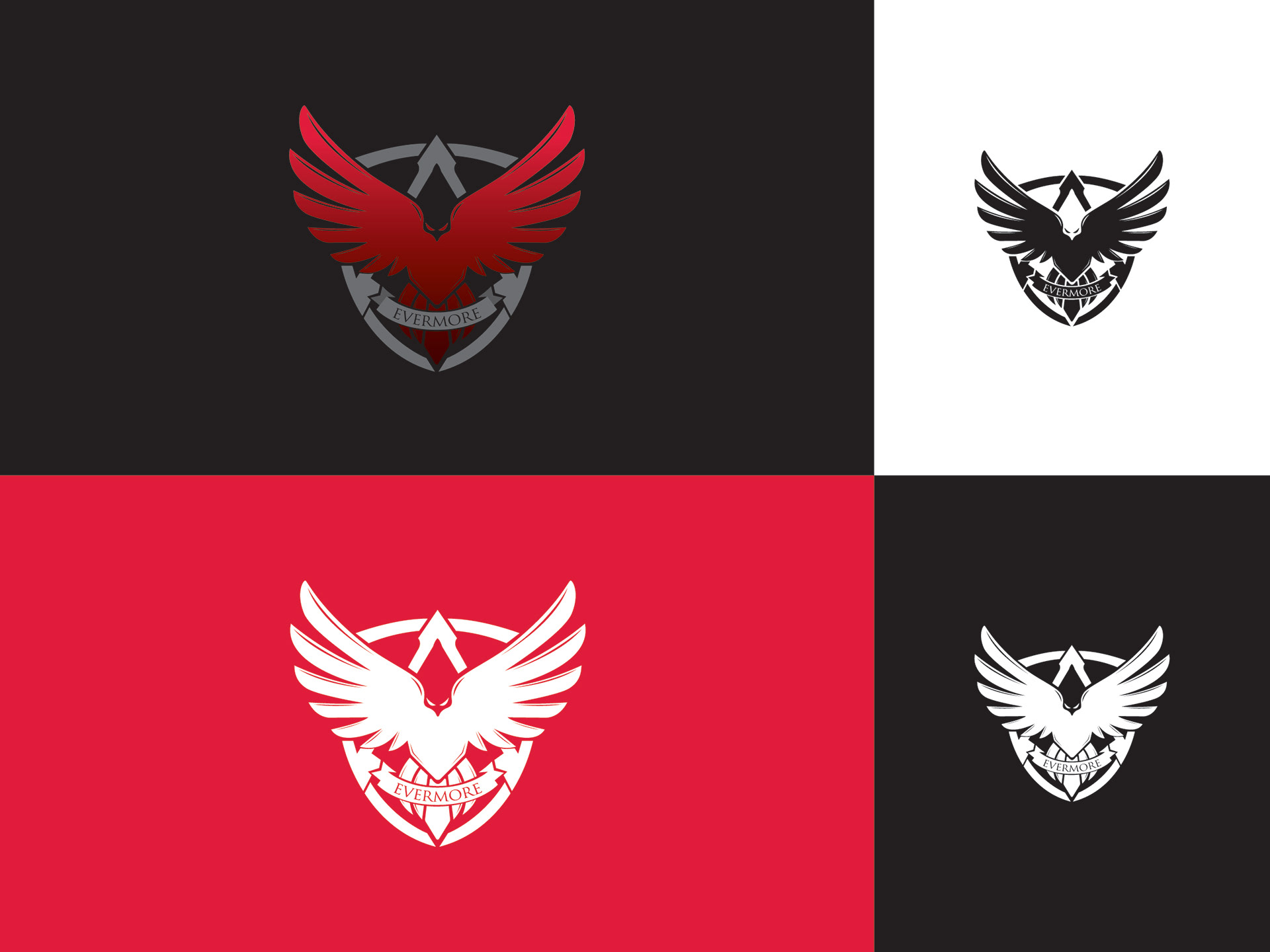
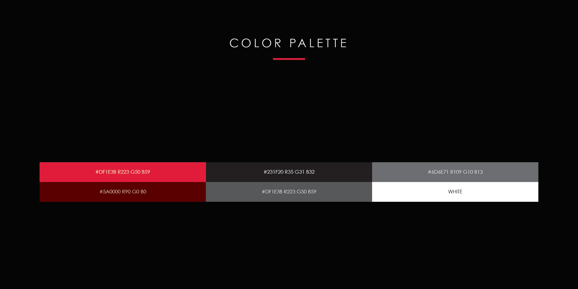
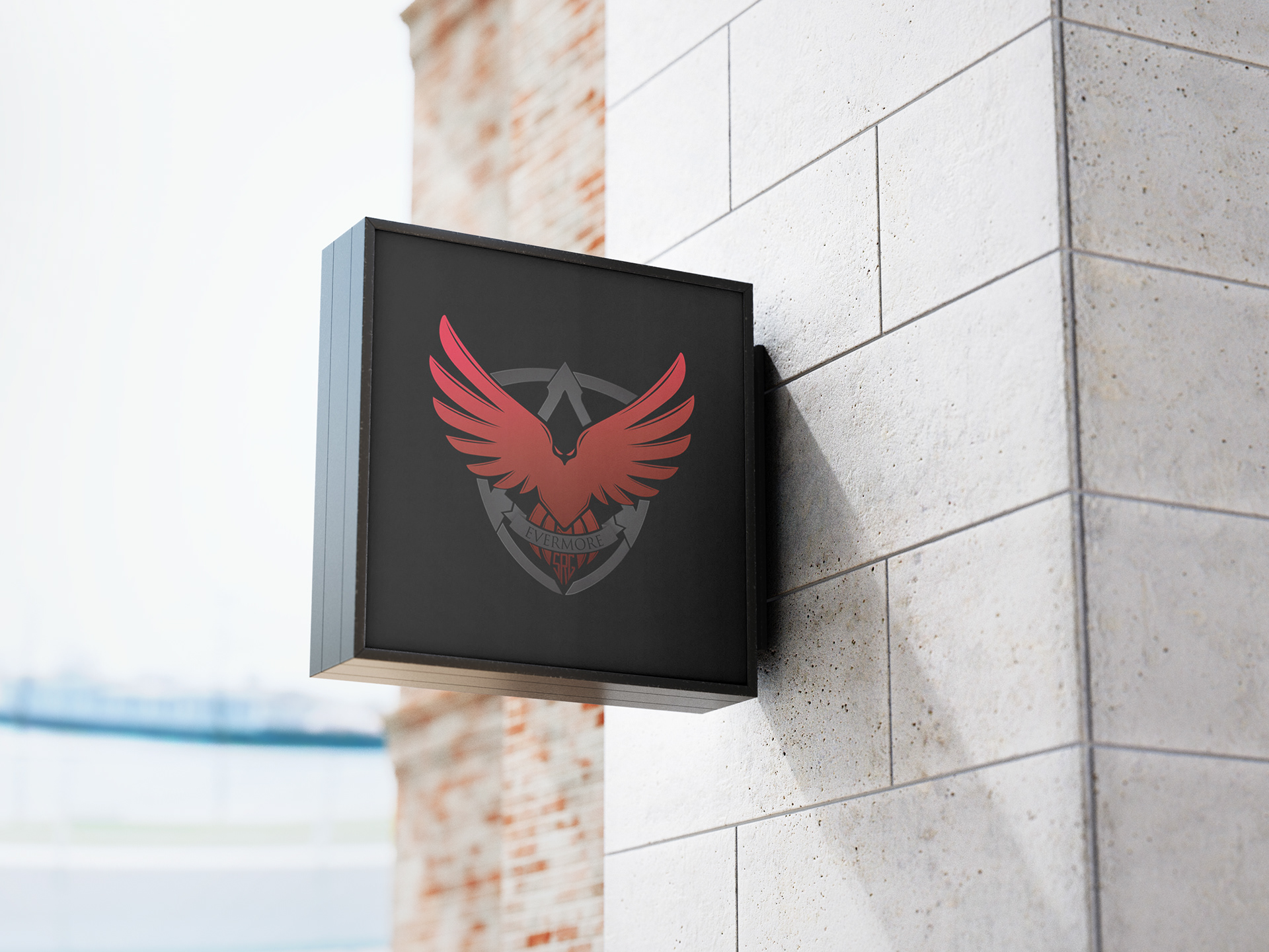
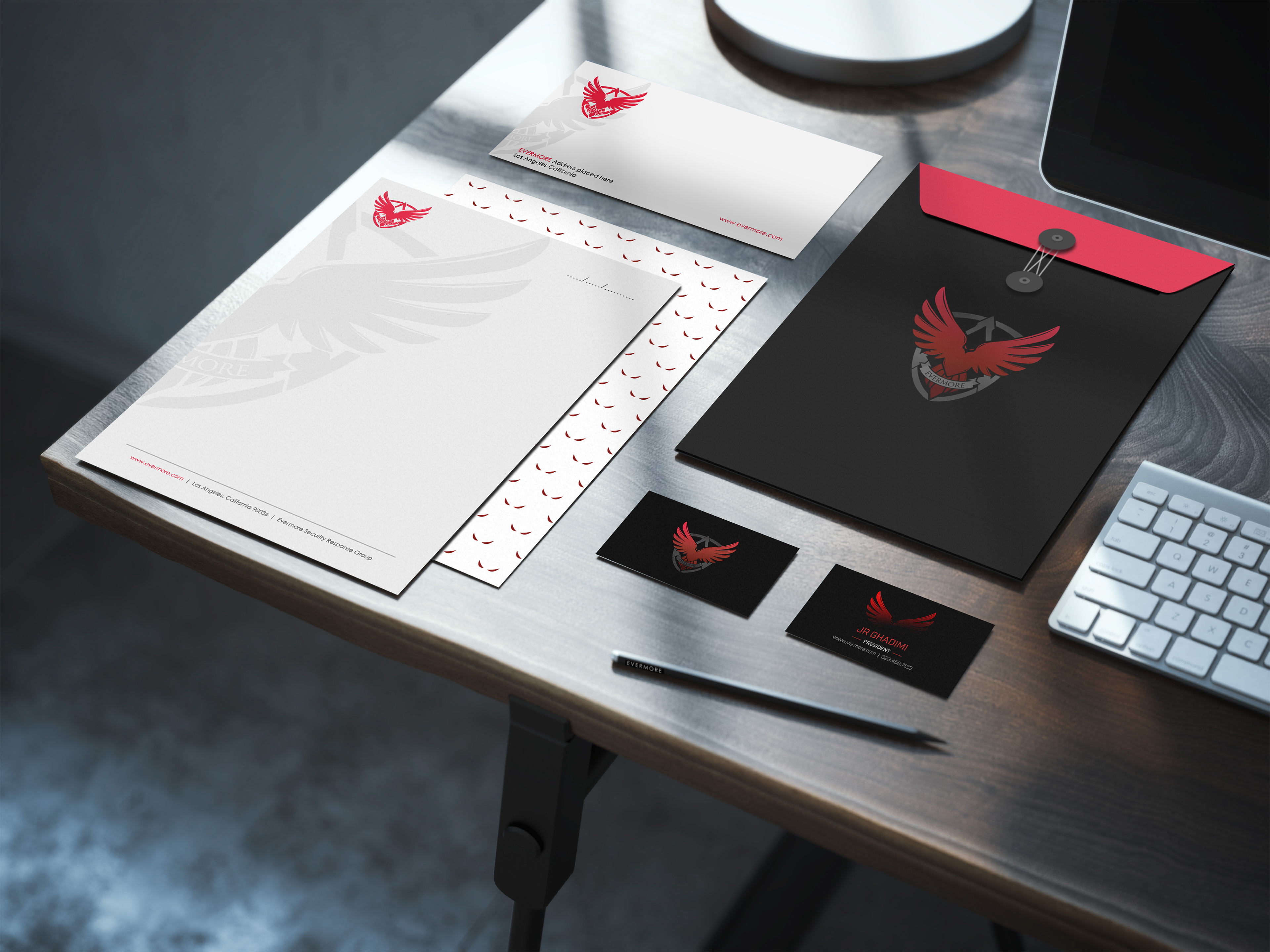
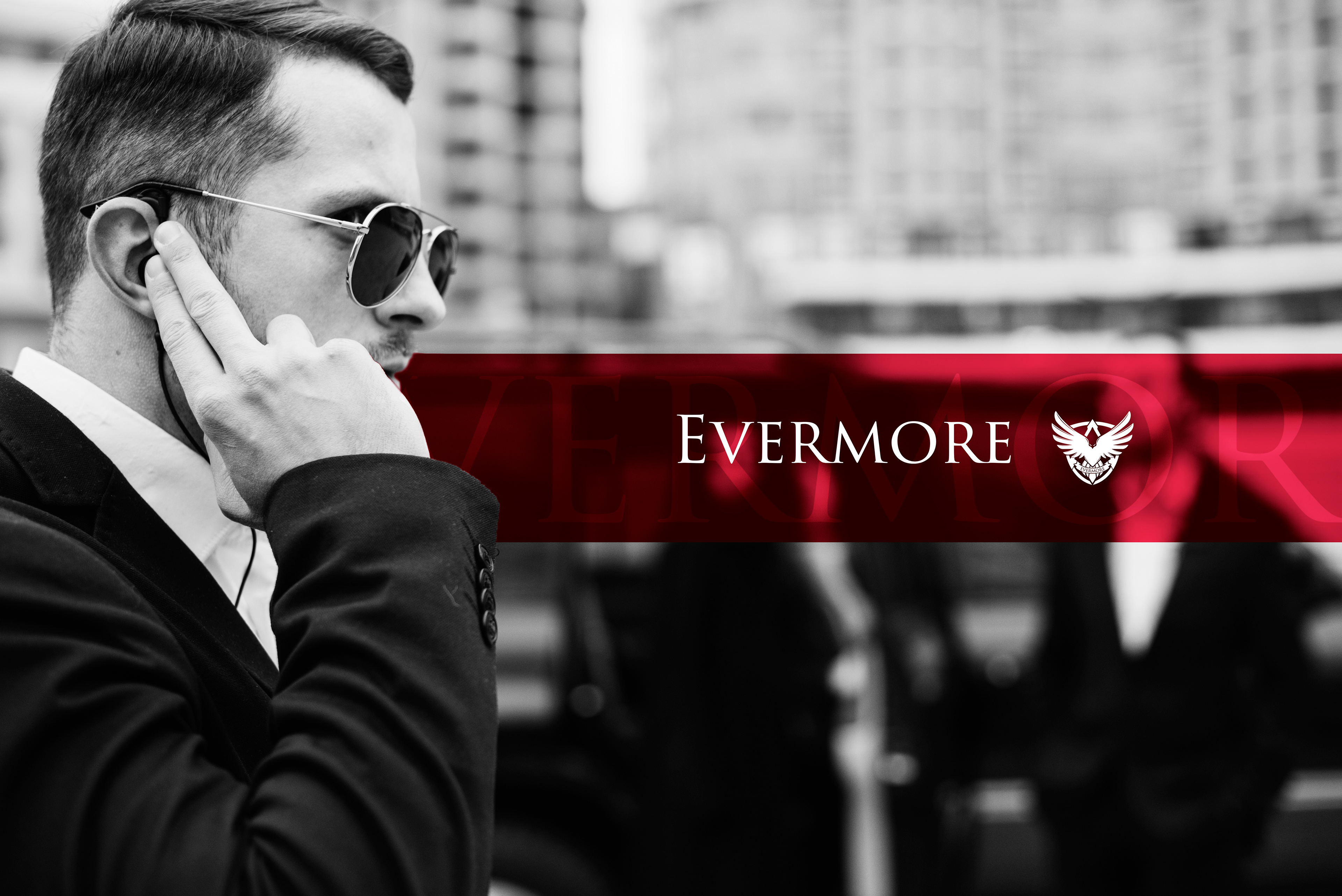
The logo blends a smooth red gradient with deep gray and near-black tones, symbolizing intensity, stealth, and power. Its form incorporates key visual motifs aligned with the brand’s identity—a shield for protection, a spear tip for offensive precision, and an eagle with outstretched wings to represent dominance, vigilance, and authority.
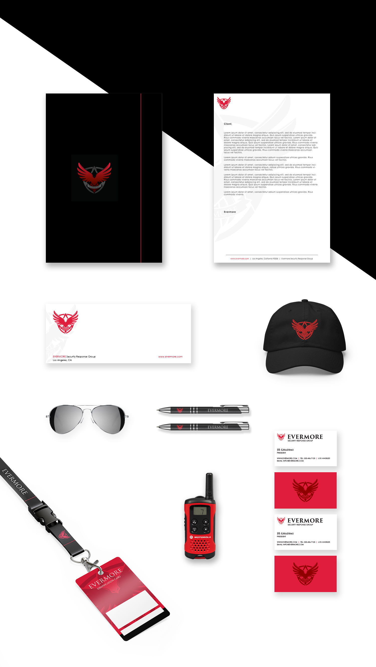
The full branding system, including marketing collateral and creative direction, established a bold, cohesive identity that matched the organization’s mission and operational ethos.